Sun Life · Concept project · 8 min read
Rethinking support before, during, and after a panic attack
- Role
- UX & Service Designer
- Timeline
- Jan – April 2024
- Team
- Team of 4, 3 designers + project lead
- Platform
- iOS & watchOS
My contribution
Research · Concepting · Service design · High-fidelity iOS UI
TL;DR
At a glance
- Sun Life challenged our team to reimagine how working women move through panic attacks, with support that arrives sooner, not just once an attack is already in full force.
- As UX & Service Designer in a team of four, I worked across research, concepting, and high-fidelity iOS design.
- We designed a proactive companion that senses the early signs (via Apple Watch), guides women through the episode, and helps them reflect afterward.
- In testing, women described it as genuinely supportive and easy to reach for, a meaningful shift from the reactive tools they'd tried before.
Overview
What if support arrived before the worst moment, not after?
Panic can be difficult to navigate, especially when the signs aren't always easy to recognize. We explored how a more proactive approach to mental health support could help working women feel prepared, supported, and more in control.
The Problem
How might we ease the panic stage in a mental health crisis?
Panic disorder affects women at roughly twice the rate of men, often while they carry the weight of demanding careers.
Yet almost every tool waits until an attack is in full force, offering little before it begins and even less once it fades. That gap became our starting question.
Research
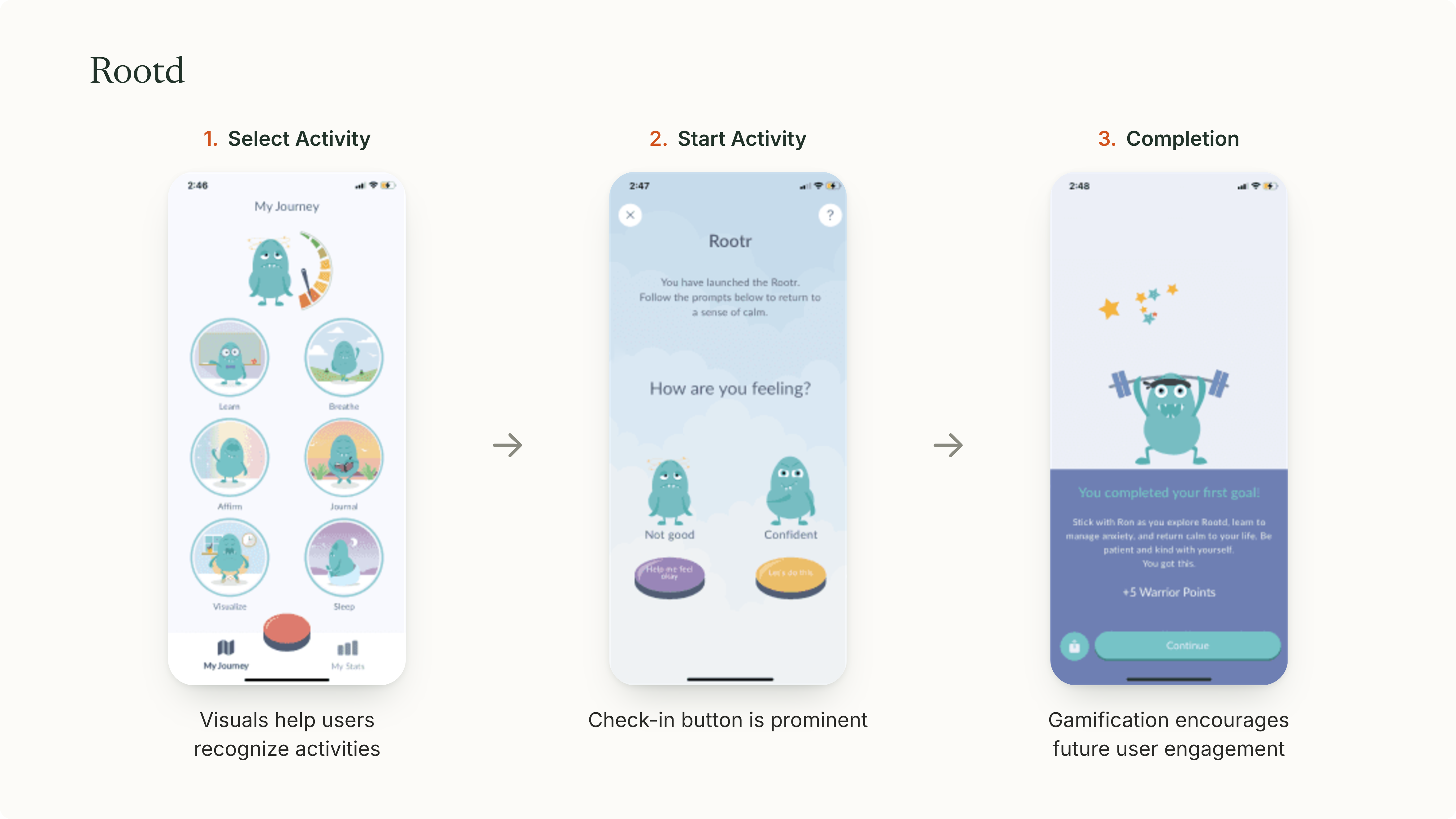
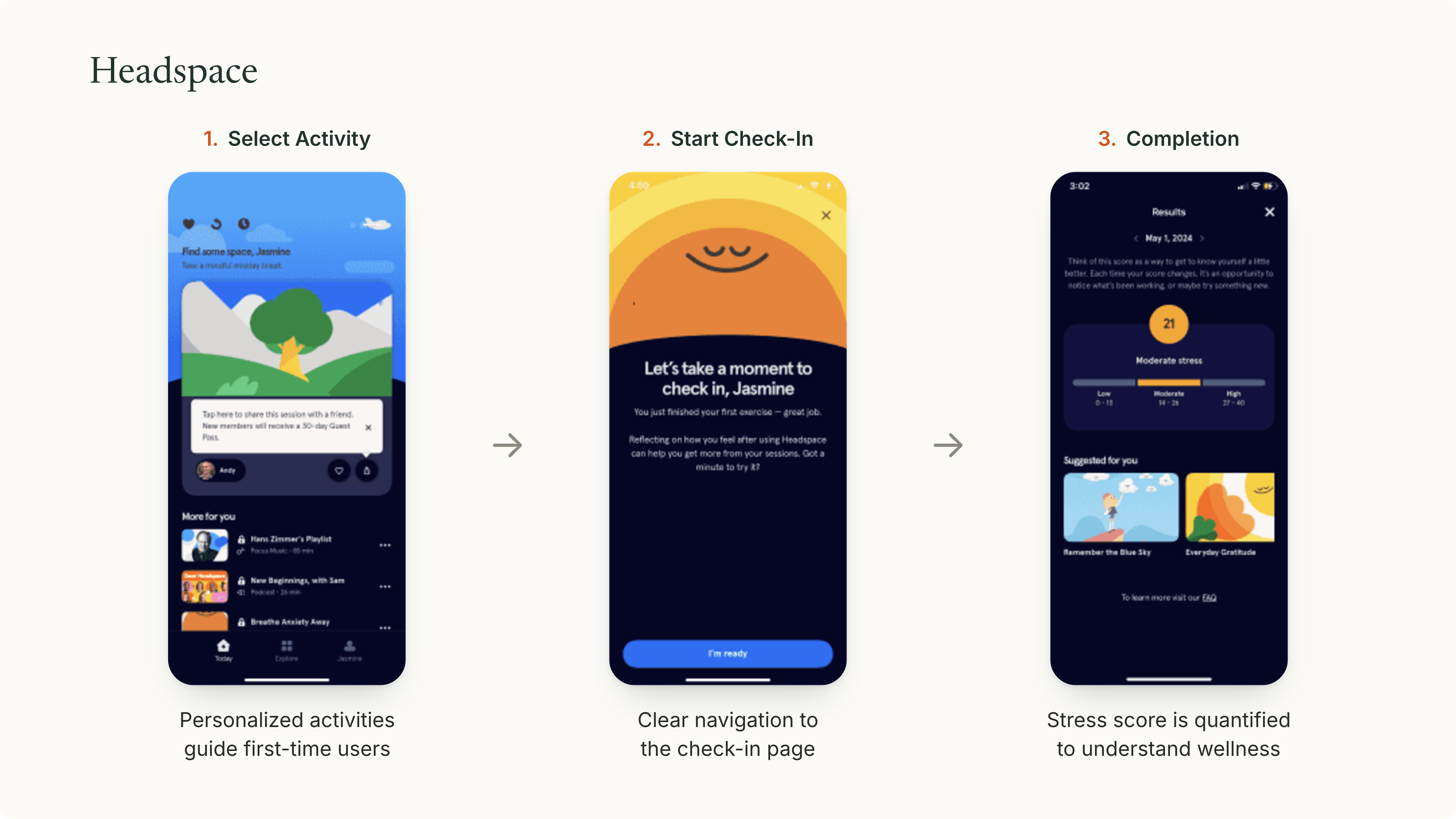
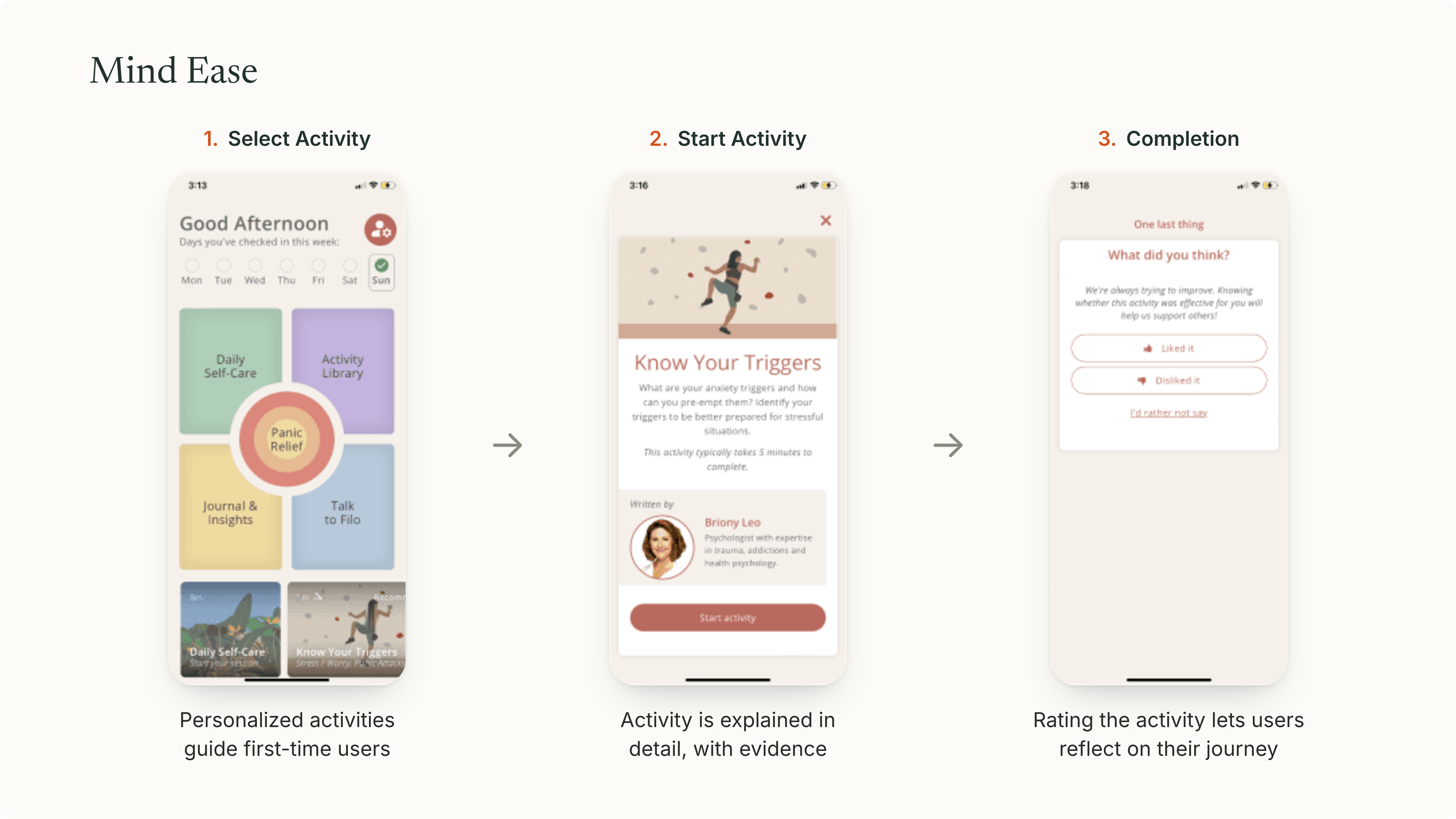
First, we looked at what already exists
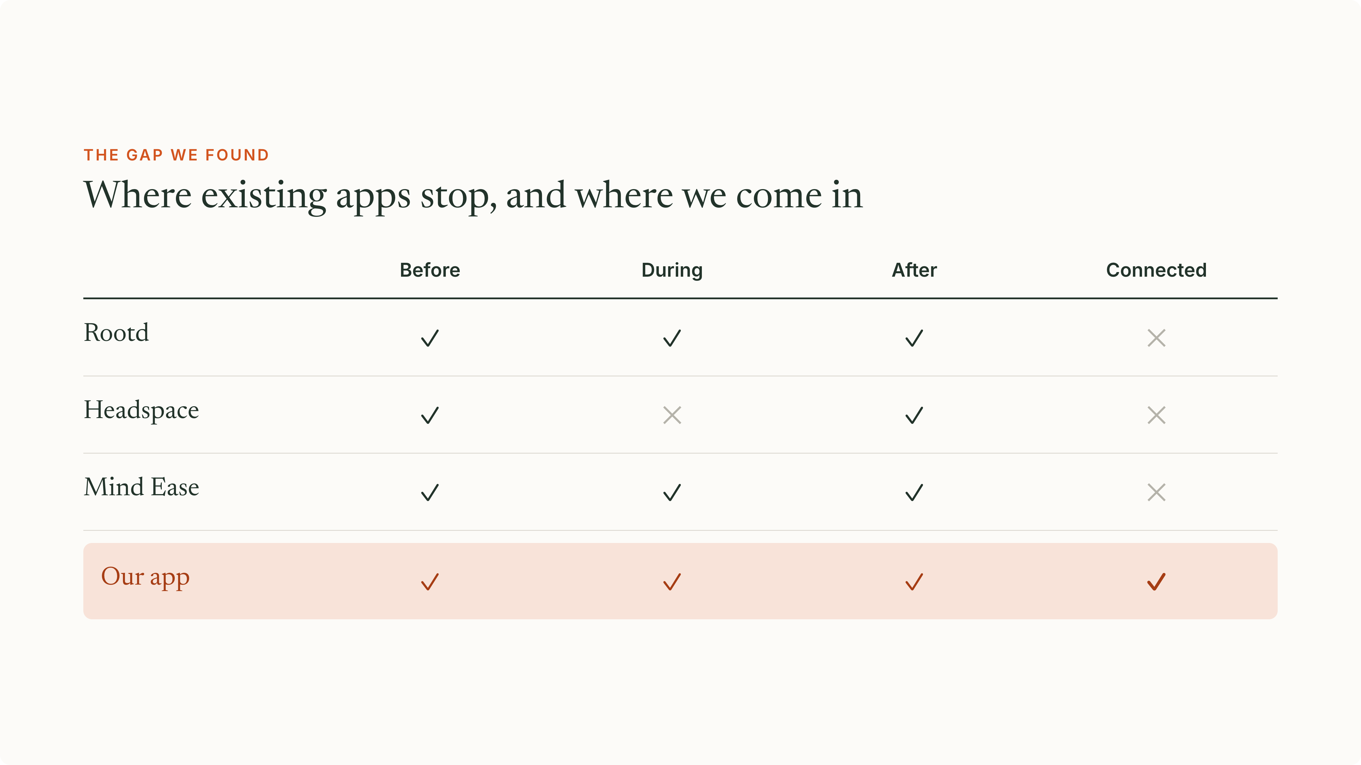
We audited the leading mental-health apps. Almost all did the same thing: wait for the attack, then react. None connected the before, during, and after, and that gap is where we wanted to build.
Research
Then we sat with the women it's for
The market showed us what was missing; the women showed us why it mattered, the fear of an episode in public, the exhaustion after, and how little their tools fit real life.
The reframe
Then one detail changed everything
Across the research and the interviews, one pattern kept surfacing, and it quietly reframed the whole project.
Evidence
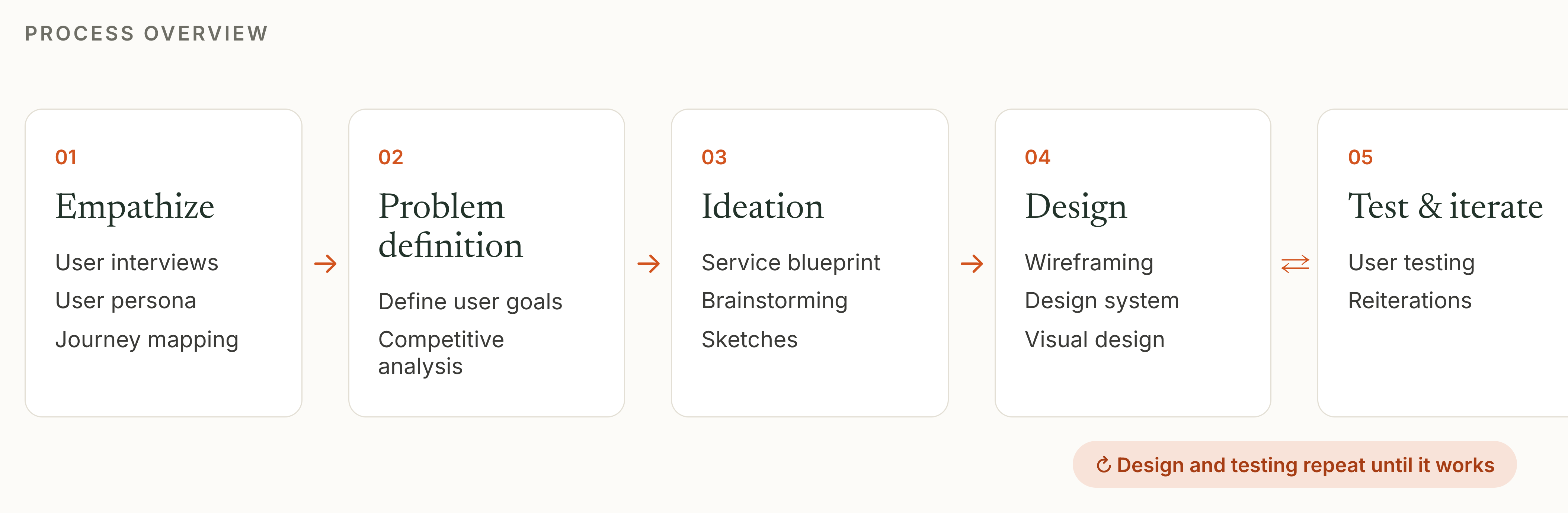
Some participants described physical changes, like a racing heart or shifts in breathing, in the lead-up to an episode.
Insight
That pointed to an earlier window, before an episode peaks, where timely support could help most.
UX implication
This suggested exploring whether wearable signals could support earlier, user-controlled interventions.
Design principles
What that moment demanded of the design
Cognitive load
Someone mid-episode has almost no spare attention, so support had to work with minimal reading and decisions.
Design decision
Became the one-tap breathing check-in, nothing to read or choose in the moment.
Context of use
It's often reached for in public, one-handed, under stress, not in a calm, focused moment.
Design decision
Shaped discreet notifications that work quietly, one-handed, without drawing attention.
Privacy & trust
Mental health is deeply personal, so sensing and sharing had to stay discreet and in the woman's control.
Design decision
Kept sensing and reflection private and opt-in, with the person always in control.
The Solution
Designing around the moments that matter.
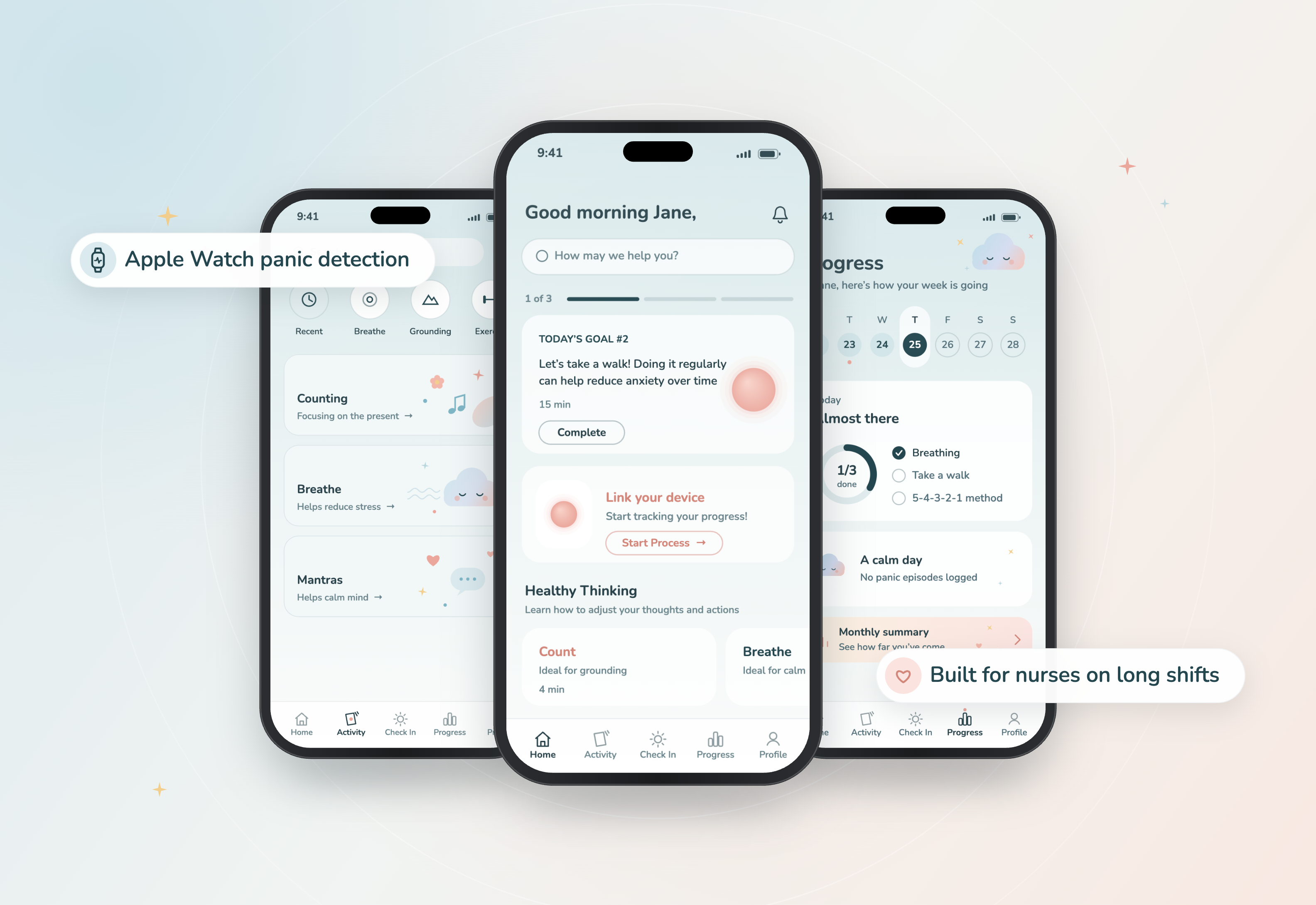
We shaped the experience around three moments: before, during, and after panic.
Before
It notices before you do.
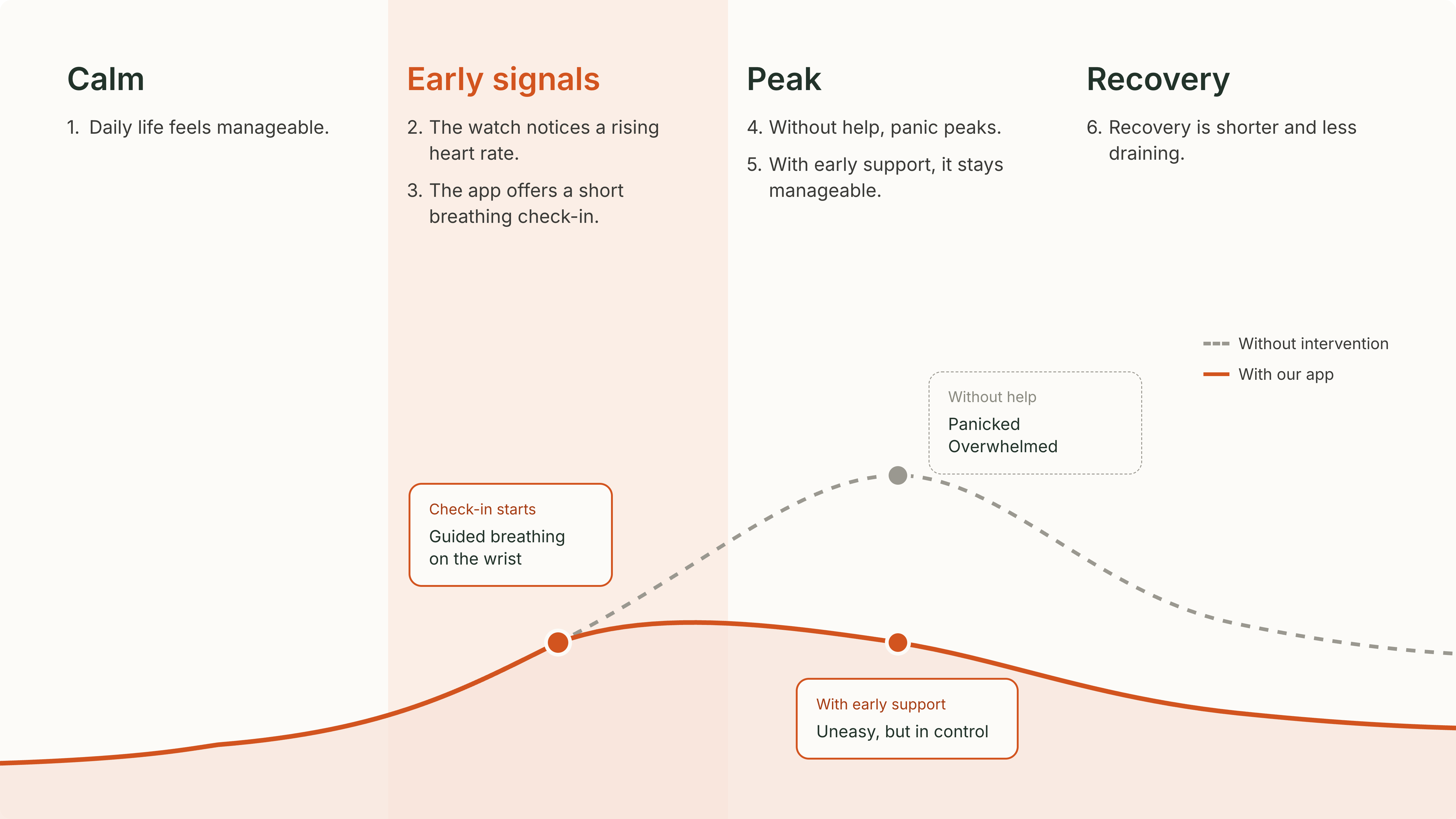
Explore early signs through proactive support and Apple Watch integration, helping users recognize changes before panic escalates.

During
Relief, one tap away.
Make coping support easier to access when users feel overwhelmed, with less effort and fewer barriers.

After
Understand the patterns.
Use the calendar to reflect on experiences over time and build greater awareness of personal patterns.

Usability testing
Refining the experience through testing.
We tested the concept with users to understand what felt intuitive, where they needed more clarity, and how the experience could better support them.
01 / 03
Support that doesn't draw attention.
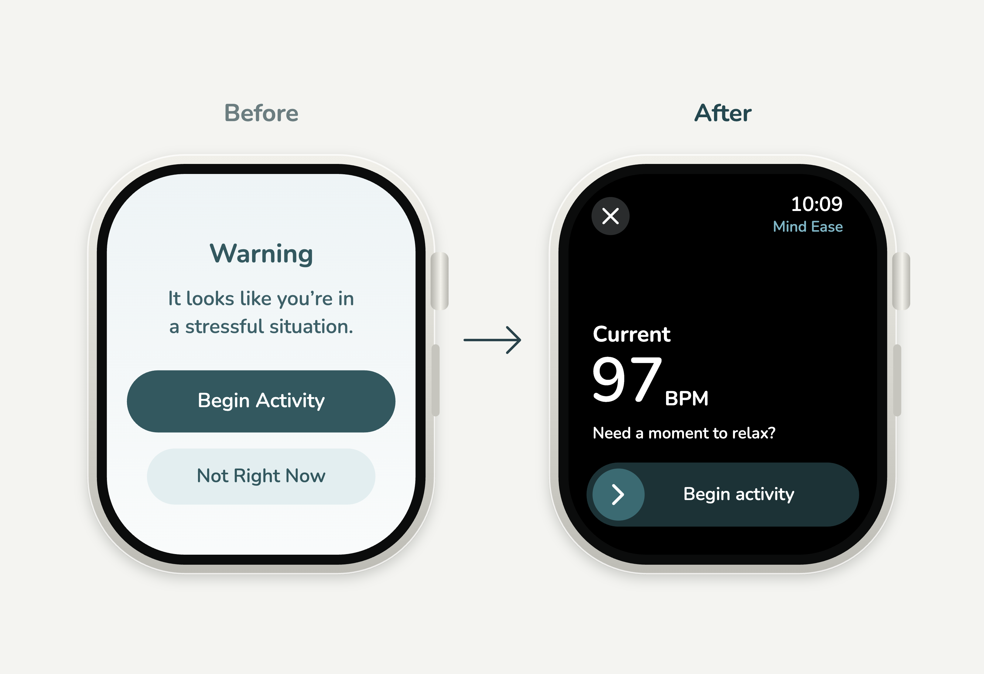
We explored how notifications could offer early support without drawing unwanted attention in professional or public settings. The experience needed to feel private, reassuring, and easy to engage with.
02 / 03
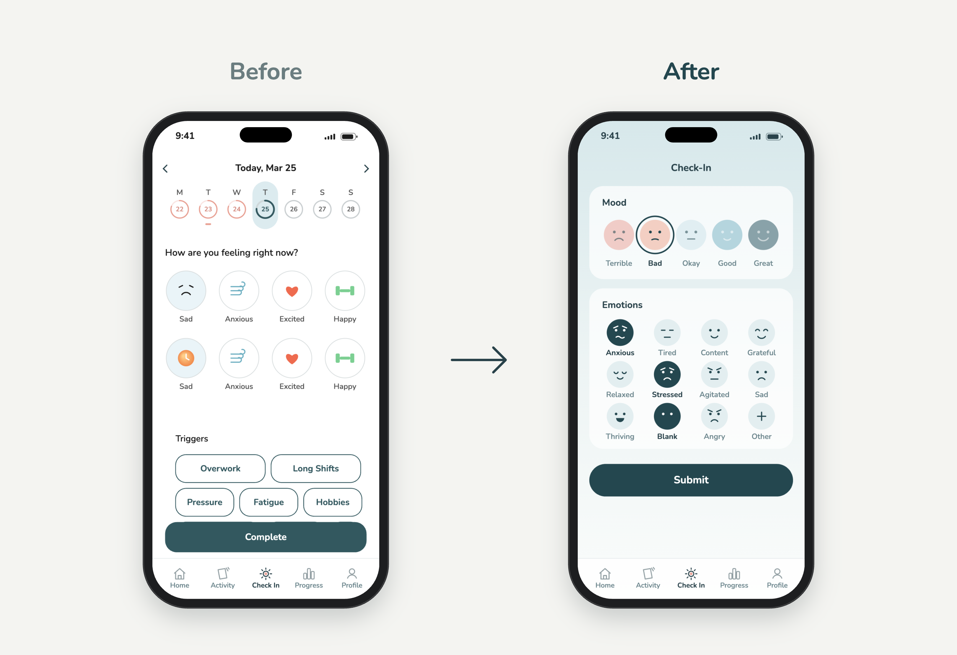
Making space for the present.
With the calendar history above the check-in, testers reviewed past days instead of logging the present, so I removed it to keep the focus on how they felt now.
03 / 03
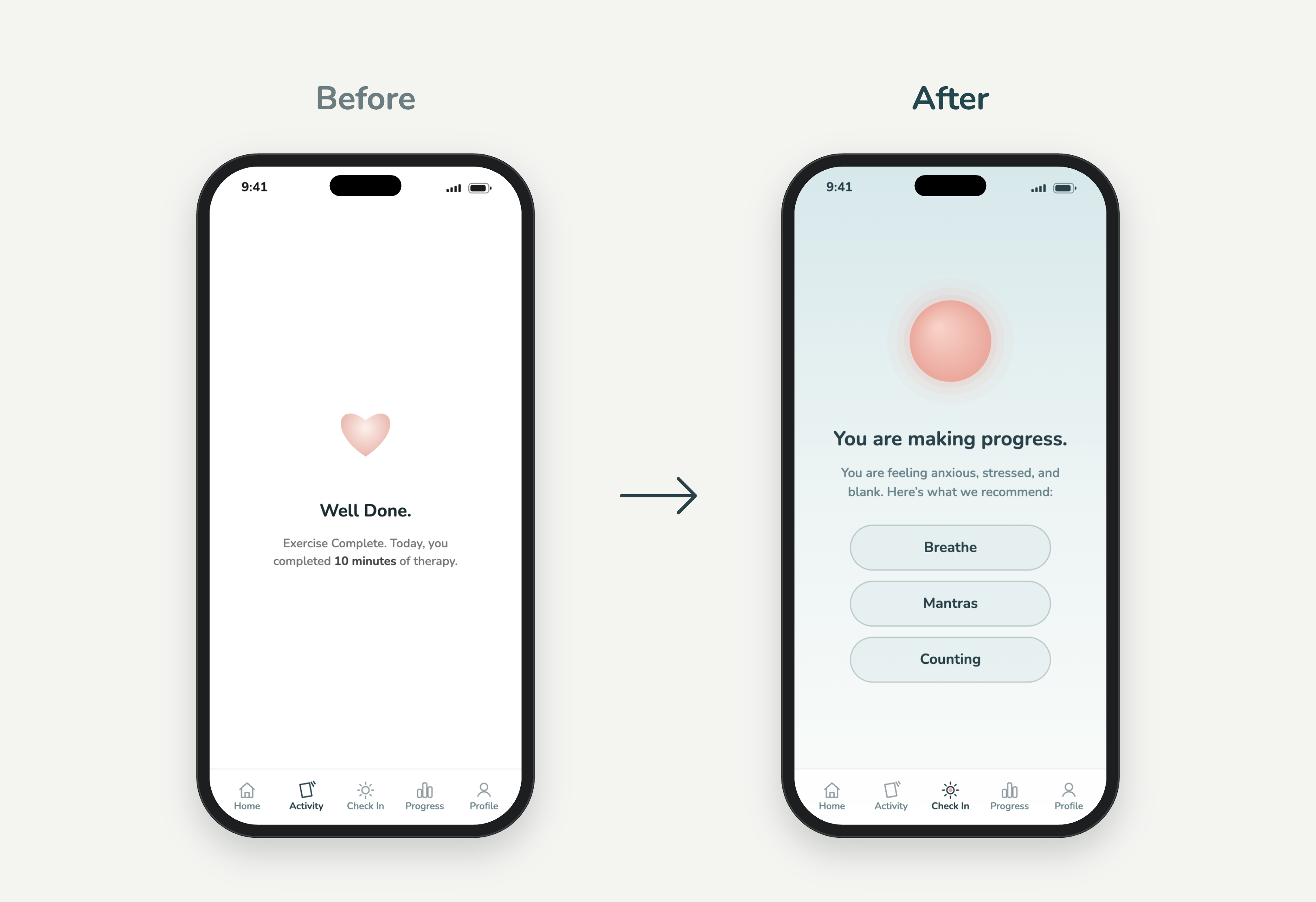
Turning reflection into action.
A simple confirmation screen left users unsure of what to do next. I redesigned the flow to transition directly from a check-in into a relevant grounding activity, making support feel more continuous.
Usability testing
Refining the experience through testing.
We tested the concept with users to understand what felt intuitive, where they needed more clarity, and how the experience could better support them.
Support that doesn't draw attention.
We explored how notifications could offer early support without drawing unwanted attention in professional or public settings. The experience needed to feel private, reassuring, and easy to engage with.
01 / 03
Impact
A more thoughtful approach to support.
As a concept project, success wasn't a launch metric, it was learning whether proactive, low-effort support actually felt right to the people it's for. Usability testing is where that got put to the test.
Testing confirmed that discreet, one-step support fit the reality of a panic episode, and it reshaped the concept along the way: removing the calendar strip that pulled focus from the present, and connecting a check-in straight into a grounding activity. The result is a concept that shows how sensing, simplicity, and timing can work together to support someone before, during, and after an attack.
Reflection
What I took away.
- 01
Design for how people feel.
An experience should account for someone's emotional and cognitive state, not just what they need to accomplish.
- 02
Let research change your thinking.
The best insights don't just improve a design. They can change what you choose to build.
- 03
Timing matters.
Support is most meaningful when people can access it at the moment they need it.
More work
Back to work
Ticketmaster
Designing beyond the ticket
- Product Design
- Design Systems
Konrad Group
Making complex workflows easier to navigate
- Product Design
- Service Design