Toronto Metropolitan University · Branding · 6 min read
One bold brand for a fragmented campus.
A concept rebrand that gives Toronto Metropolitan University a confident, cohesive identity, from logo and type to color and campus applications.
- Role
- Brand & Visual Designer
- Timeline
- 2022 · 5 weeks
- Team
- Solo Project
Overview
One university, one voice
Walk across TMU's campus and you'll notice something: every faculty seems to speak in a slightly different visual language. A logo here, a colour there, none of it quite adding up to one institution. For a university with so much energy, the brand didn't match.
This self-directed project asks what it would look like to bring that all together, a unified, modern identity that still feels warm and student-first. I owned it end to end: brand strategy, logo design, type and colour, and a set of applications showing the system in the wild.
The Brief
A fragmented identity that lacked cohesion
Across faculties, signage, and digital channels, TMU's visual language varied wildly. Inconsistent logos, colours, and type quietly chipped away at the feeling of one confident, connected university.
So the brief wrote itself: how might I craft a flexible identity system that ties every touchpoint together while still feeling unmistakably TMU?
Research
Grounding the direction
I started by auditing the existing brand and studying how peer universities present themselves, looking for the white space TMU could confidently own. From there, mood boards helped me pin down a tone: contemporary, self-assured, and full of life.
Talking with students kept me honest about what mattered. The identity needed to feel approachable, bold, and unmistakably urban, a reflection of the city it lives in.


Process
From sketches to a system
I filled pages with logo directions before letting the strongest marks earn their way to the screen. Each one got stress-tested, shrunk to a favicon, blown up to a banner, dropped into real contexts, to make sure it held up everywhere it would need to live.
Type and colour followed the same discipline: chosen to be legible, accessible, and flexible enough to carry the brand across print and screen without ever losing its voice.


The Identity
The identity system
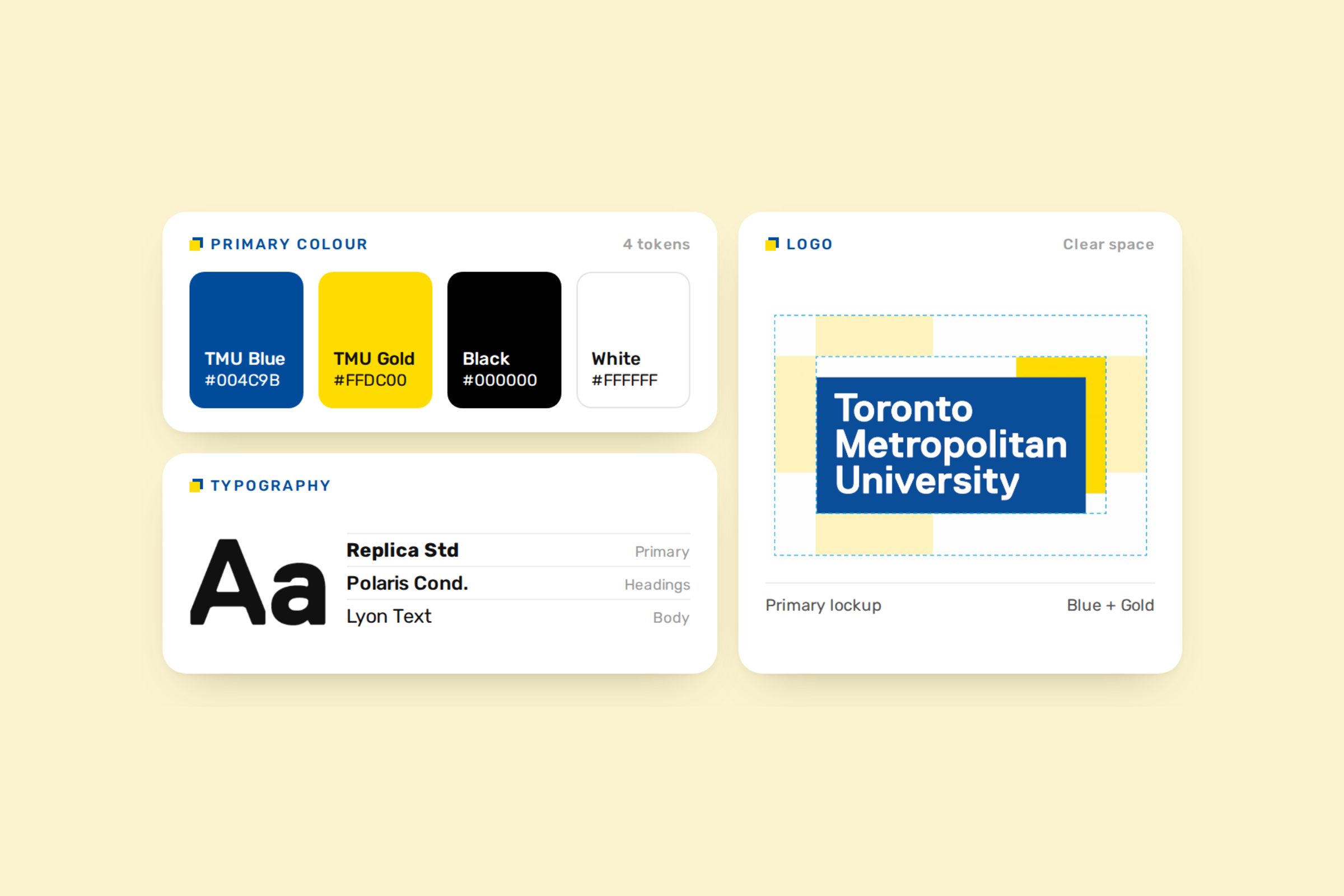
The result is a system, not just a logo, a confident wordmark, a bold palette, a clear type hierarchy, and a flexible toolkit that lets every faculty feel part of one TMU.
01
A confident wordmark
A refined logo and wordmark that scales cleanly from a favicon to a building banner.
02
A bold, accessible palette
A focused color system anchored by TMU blue and gold, tuned for contrast across print and screen.
03
A clear type hierarchy
A pairing that balances a distinctive display face with a highly legible workhorse for body copy.
04
A flexible toolkit
Graphic elements and layout rules that keep faculties on-brand while giving them room to flex.


Impact
Results & learnings
In critique, the system landed exactly as I'd hoped, people described it as cohesive yet flexible, and said it looked instantly recognizable across every mockup, from a poster to a phone screen.
More than anything, the project deepened how I think about branding. The real craft isn't drawing one perfect logo; it's writing the rules that keep a brand feeling like itself everywhere it shows up.
More work
Back to work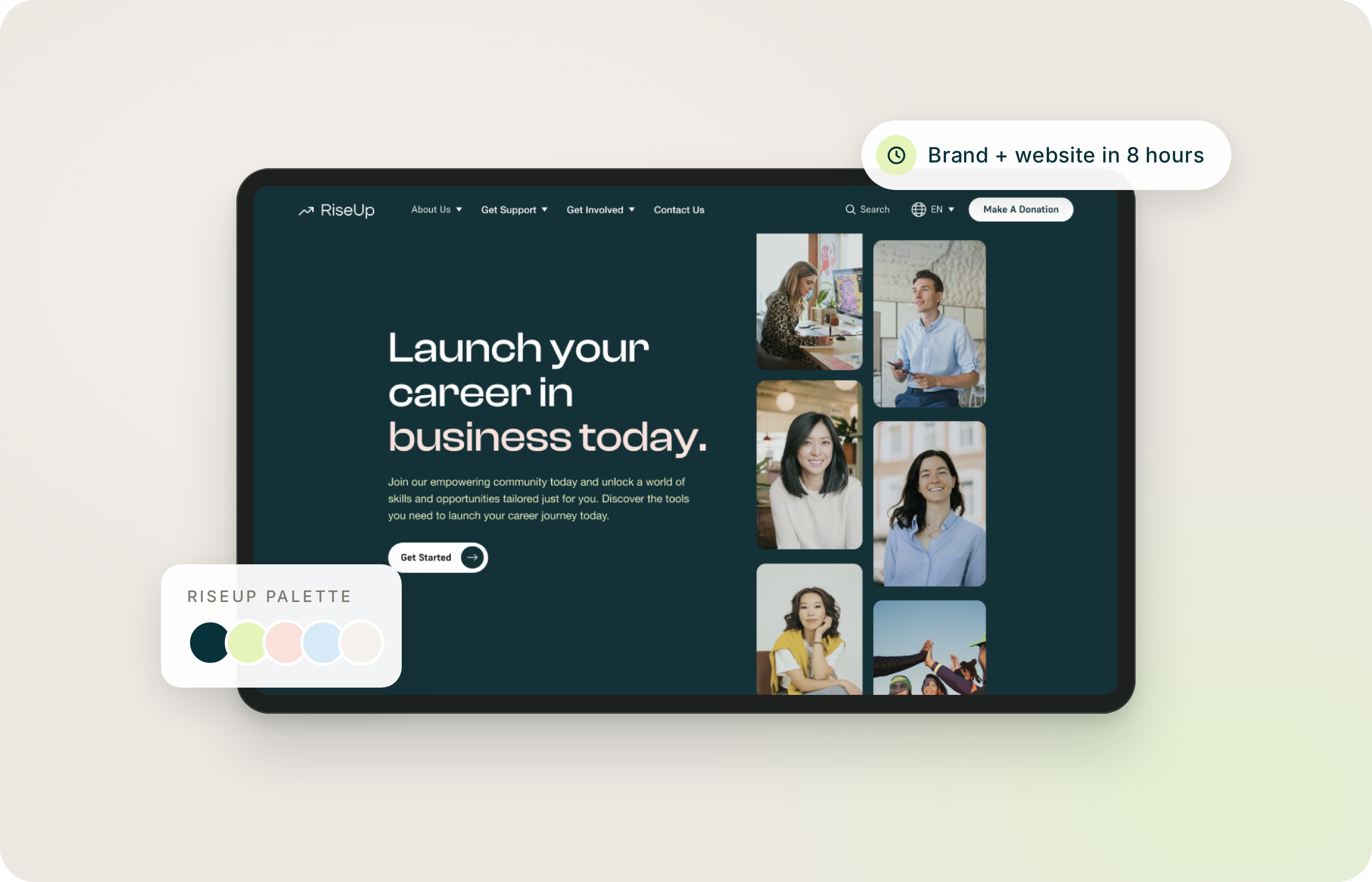
Konrad Group
Making complex workflows easier to navigate
- Product Design
- Service Design
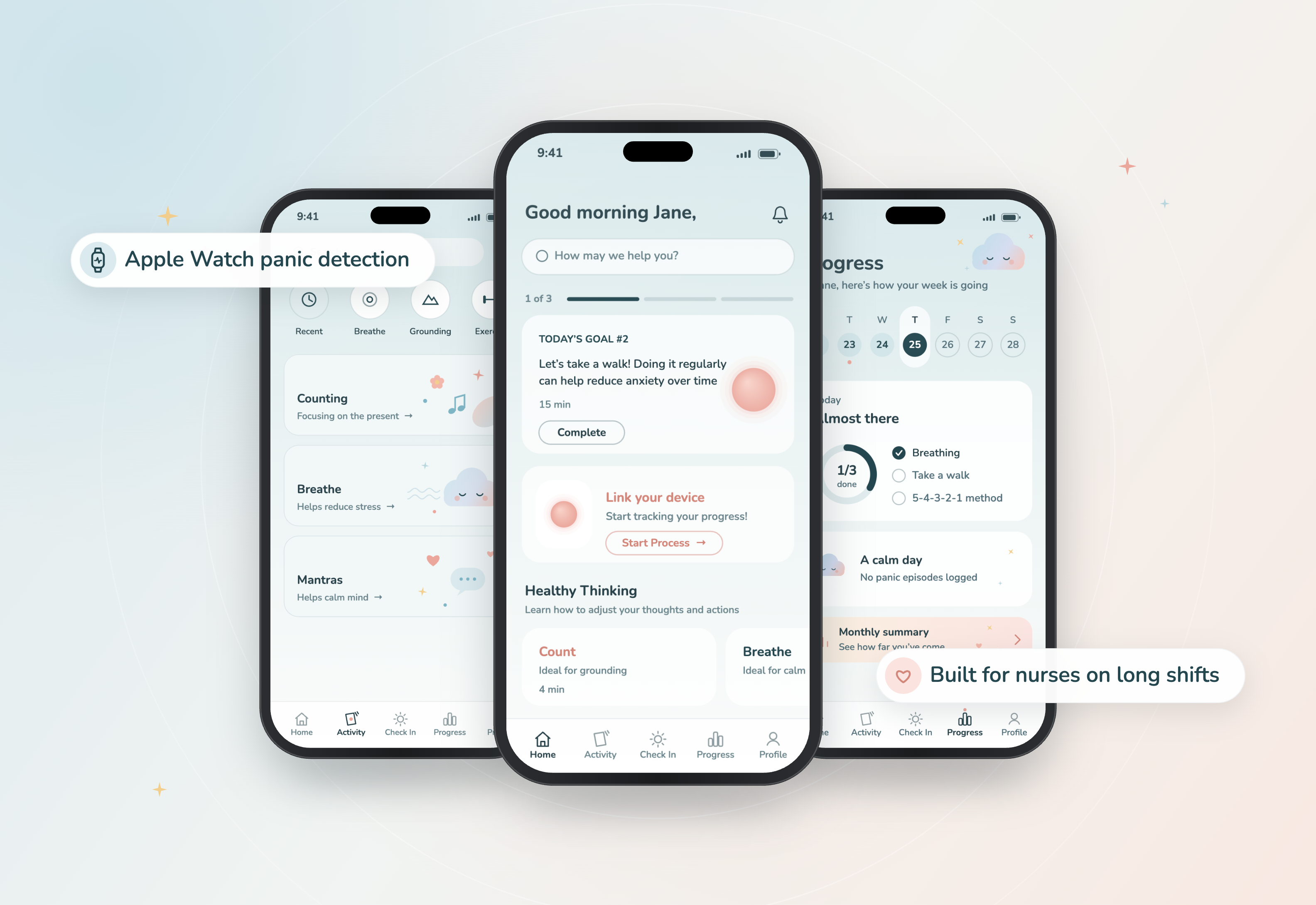
Sun Life
Rethinking support before, during, and after a panic attack
- Mobile Design
- UX Design
- Service Design